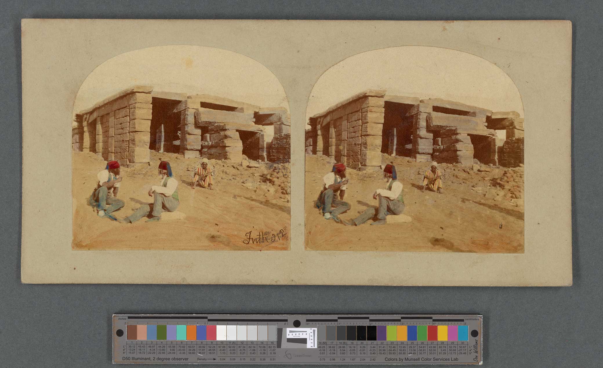
From a collection of stereoscopic photographs taken in Egypt, Sudan, and Ethiopia by Francis Frith, 1860. The New York Public Library, Miriam and Ira D. Wallach Division of Art, Prints and Photographs.
Color is among the most challenging aspects of our experience to describe. Spectrophotometers and colorimeters can quantify light waves, yet their measurements have little impact on our feeling for color. As the philosopher Zeno Vendler put it, “Vincent van Gogh loved the color yellow—and certainly not because of its wavelength.” Color is infamous for its variability in language and perception. How can we know that what we are seeing is the same as what someone else sees? How can we separate what we are seeing from the thing itself? Or, as Ludwig Wittgenstein asked in his Remarks on Colour, “Where do we draw the line here between logic and experience?” In the Remarks, written the year before his death in 1951, the philosopher’s thoughts about color invariably lead back to the study of philosophy. What things are knowable? How are they known? What can be determined through philosophical reasoning? Wittgenstein reflected, “Colors are a stimulus to philosophizing.”
Color can reveal the variety of experience in a way that few other subjects can. Vision, whether described in language or represented in paintings or film or virtual reality, is the quotidian version of locked-in syndrome. In literature and poetry, the personal nature of color perception often serves as a metaphor for other sweeping failures of communication. In everyday conversations, those stumbling, destabilizing references to a blue sweater (it’s actually black) or a green car (it’s blue, in fact) are both forgettable and earth-shattering. For some philosophers, the experience of color is most similar to that of pain: an internal state that resists quantification. But who wouldn’t rather philosophize about azure instead of aches and pains?
In the Remarks, Wittgenstein briefly considered color in photography, though he was quick to note that his example was “not a color photograph.” For someone born in 1889, color photography was still an exception to the rule. Wittgenstein describes but does not name an image of a scene in a machine shop. In it, he saw “a man with dark hair and a boy with slicked-back blond hair standing in front of a kind of lathe, which is made in part of castings painted black.” “What does it mean,” he asks, “that hair looks blond in a photograph?” He identifies several types of metal in the shop—the painted castings, galvanized wire, iron, and zinc, which all seem truthfully represented by shades of gray in the photograph. But the blond hair confounds him: “How does it come out that it looks this way as opposed to our simply concluding that this is its color?” Wittgenstein seems to immediately perceive color in the black-and-white photograph, rather than logically deducing that the light-toned hair must be blond.
For Wittgenstein’s younger readers, color photography was fast becoming the norm. A 1956 color film booklet enthused: “The lifelike beauty, the realism, the high-fidelity color quality that you get with your camera and Anscochrome Film will give you endless satisfaction. For you will not only record but actually reproduce and re-create the original beauty and sparkle of the subject in the finest form for future enjoyment.” As color photographic processes proliferated so, too, did boosters’ praise for them. The most common descriptors were “natural” or “lifelike,” despite the obvious differences in color rendition between film stocks. Kodachrome appears blocky to contemporary viewers, offering a limited dynamic range and low contrast. Fujifilm is known for its vivid greens. Polaroid instant color prints can seem milky and unsharp. All were touted as “natural.”
Photographers’ studios have added color to photographs by hand since the medium’s earliest days. Three of the first five U.S. patents related to photography described methods to add color to the monochrome process. Painters employed by photography studios added everything from a subtle blush tint to the lips and cheeks or dabs of gold to jewelry to create radically overpainted images. While the public apparently clamored for colored photographs, critics were unconvinced. Their most common charge was that by painting over the image, less skilled photographers could cover up their errors—and the truth of the original photograph.

In comparison, mechanical color processes promised to amplify photography’s authenticity. They did not rely on the artist’s hand to add color after the fact. Some mechanical color processes, such as the French Autochrome, were available to professionals in the early twentieth century. But color photography became a widespread possibility only in the mid-1930s with the invention of Kodachrome film, first made available for 16 mm motion pictures in 1935 and for 35 mm still cameras the following year. Technicolor film stock was introduced in 1932. It was critically praised in 1939’s The Wizard of Oz, which used the transition from black-and-white to color film to dramatize the shift from Dorothy’s reality in Kansas to the fantastical world of Oz. Technicolor, with its vibrant, highly saturated colors, was celebrated as better than the real thing.
Kodachrome and other films designed for the still photography market instead claimed faithfulness to reality. One very early instruction manual promised that “the introduction of Kodachrome has placed in the hands of the nonprofessional user a color medium which will reproduce color with almost perfect fidelity.” A spate of how-to books accompanied the new technology, offering instructions on everything from exposure and printing to “how to see color.” These included warnings about using “color for color’s sake” or including so many colorful elements in the frame that it became, in one Kodak editor’s words, “a veritable ‘color hash.’ ” Another author cautioned against making a very specific, but apparently ubiquitous, picture: “We are not particularly interested in a beautiful girl clad in a brilliant red bathing suit playing with an equally brilliant blue, yellow, and green beachball.”
Professional photographers remained skeptical of color film. In instructional guides, they qualified the manufacturers’ claims about natural color. A photographer for the American Museum of Natural History explained in 1941 that Kodachrome “has no subjective reactions. What it sees is not colored by previous knowledge or experience. When the color film sees grass, it doesn’t insist, as we are so apt to, that all grass is green. It may see brown grass or blue grass or other colors that look all wrong to us in the processed film.” Notable photographers, including Berenice Abbott and Louis Stettner, also took care to point out that humans and film “see” color differently. Abbott suggested that some of the difference lay in our past experiences: “When we judge the color photograph, we not only think of how the subject looked in nature, but we also remember how painters throughout the centuries have rendered similar objects. The color photograph has to satisfy a double standard—fidelity to real life and a recognizable approximation to traditional art.” These caveats beg the question: Which color is natural? What we’ve trained ourselves to see or what is out there in the world?
By the 1960s color film dominated the amateur market as well as the movies. Color negative film became available for Kodak’s easy-to-use Instamatic camera in 1963; Polaroid debuted instant color prints the same year. Snapshots in color offered a broad swath of viewers some of their first apparently objective experiences of light, uninfluenced by the brain’s adjustments. The new film, which was initially color balanced for daylight, could not make the perceptual changes that we do when we see objects in different types of light. We think of an apple as being the same color whether we look at it on a tree or on display in a grocery store. When asked to draw an apple, a child will seldom stop to inquire where that apple appears: Indoors or out? Under warm or cool light? But, as physicists will eagerly tell you, color is merely the product of reflected light. An apple doesn’t possess the color red; it reflects red wavelengths while absorbing others. We see the reflected light. But which colors are reflected is also determined by which colors are present in the light. Film prepared to respond to the color temperature of bright sunlight (6500 Kelvin) makes the lower temperatures of incandescent lights appear orange, while fluorescent bulbs render the scene markedly green. An apple is never simply red.

Although the changing colors of sunlight had been amplified by Impressionist painters of the late nineteenth century—think of Monet’s snowy haystacks in periwinkle dawn or the Aperol orange of his Rouen Cathedral at sunset—these strange visions now began appearing in amateur snapshots. A 1962 Kodak manual recommended the warm tones of sunset and sunrise for dramatic landscapes but cautioned that they were inappropriate for portraits. The reddish light would render the family like a pot of “boiled lobsters,” according to the author, evidently thinking only of the effect on light skin tones. Similarly, the popular how-to author Fred Bond wrote of photographing during those forbidden hours, “If flesh tones appear badly ‘sunburned,’ do not blame Kodachrome. It recorded what it saw.” During this period color film privileged not only bright, white sunlight but also white skin. Kodak film labs and at-home printers used a company-provided color chart that featured a photograph of a white model, designating white skin as “normal.” Owing to the limited tonal range of color film at the time, when photographers exposed and developed for the light end of the spectrum, darker tones fell into shadow, leaving no detail or tonal gradations.

Kodak didn’t respond to this bias in the chemical makeup of their film until the 1980s with the release of two new film stocks: the professional film Vericolor III and Kodak Gold Max for amateurs. These improved the color rendition of a wider variety of skin tones, enabling better representation of detail across the spectrum. Within ten years, the sunburned state was reimagined as a golden glow in popular writing on photography.
Long before the invention of photography, natural scientists, artists, and craftspeople had struggled to communicate about color. Although Japanese artists had been creating multicolor woodblock prints since the mid-eighteenth century, printing in the West largely relied on a secondary process of hand coloring until the rise of chromolithography in the late nineteenth century. Some disciplines, such as heraldry, established notational systems to specify color in monochromatic prints. Engravers used different styles of hash marks to indicate the colors used in coats of arms. Sometimes engravings and woodblock prints were colored by teams of colorists before their sale, but others were colored by their owners, according to their own preferences or interpretations.
 of the Theaters in Sakaichō and Fukiyachō on Opening Night</em>, by Utagawa Toyoharu, c. 1780. Bottom: Plate IX from <em>Choix de Coquillages et de Crustacés</em>, by Franz Michael Regenfuss and Margaretha Helena Regenfuss, 1758. The Metropolitan Museum of Art.")
This multihued world was less than ideal for scientific treatises striving to identify and communicate about elements of the natural world. Although many colors are named after the minerals from which they are derived, such as cobalt blue or cinnabar red, communicating about other hues or colors of varying saturation or intensity quickly becomes a challenge. Color charts were developed to link color names with singular objects in the world. The first complete color system published in England was produced by an entomologist, Moses Harris, in the eighteenth century. Although The Natural System of Colours was meant for artists mixing pigments, Harris also applied his color theory to the description of insects. Only by creating and disseminating a standard, against which other samples could be compared, was it possible to confirm a particular shade, whether it appeared on a portrait bust or a bug.

In 1905 the Boston-based art instructor Alfred Munsell published a diagram and a corresponding system of identifying numbers that quickly became standard. The Munsell materials included color charts featuring thick paint chips that students could move around to observe how colors change in relation to one another. The Munsell color system was soon recommended for use by scientists and officially adopted by the U.S. Department of Agriculture in the 1930s to describe soil color, an indicator of soil composition and health. Today farmers and foresters, artists and archaeologists, industrial bakers, geologists, geographers, and even forensic scientists all refer to the Munsell Classification System when communicating about color. Using the Munsell reference booklets, which include pages of printed color chips with holes punched in them, a researcher can compare the Munsell color to the thing in the world, record its reference number, and share the number with others. The Department of Agriculture’s manual issues this strict warning: “Bizarre names like ‘rusty brown,’ ‘mouse gray,’ ‘lemon yellow,’ and ‘chocolate brown’ should never be used.” Instead Munsell describes these colors by their alphanumeric references, such as 2.5YR3/4 or 10YR6/2.

Perhaps inspired by these charts, Kodak began publishing their own standards, called Kodak Color Control Patches or Color Separation Guides. The paper strips included seven rectangles of the varied colors commonly used in photomechanical printing, plus black, white, and gray. The Color Control strip was particularly useful for making scientific photographs, copies of artworks, or color checking products in reproduction. A photographer would include the card in the scene to be photographed. When the resulting image was sent elsewhere, viewers could confirm the colors in the scene by comparing their Color Control cards with the one depicted in the photograph. Printers could also correct the output colors later, so that the image was properly exposed and appeared in neutral light. These cards still appear in photographs of museum, library, and archival collections; when properly used with a color-calibrated screen, they can help distant researchers cut through the many layers of mediation in digital imagery.

According to midcentury handbooks, some viewers remained skeptical even of highly controlled color images. The authors of a 1937 book recalled the dismay of viewers who reported that color photographs weren’t “at all like the real color!” Even after a side-by-side comparison, these viewers insisted that their memory of the color was different. The artist Josef Albers made the same argument in his 1963 book on color theory, Interaction of Color, suggesting that “it is hard, if not impossible, to remember distinct colors.” A U.S. Department of Agriculture study found that observers wouldn’t use the same color name when faced with the same sample on different occasions, even under identical lighting conditions.
While many midcentury commentators were content to gesture vaguely to poor memory or a lack of objectivity, inventor Edwin Land dedicated twenty years of experimentation to trying to explain these effects. Land was critical of color photography, despite his role as Polaroid’s founder and chairman, because photography “reinforced the belief that the colors discerned by Newton in the spectrum are, with minor qualifications, the colors of the world around us.” Color, in Land’s view, is largely internal. It is far more influenced by our expectations than by any other factor, even ambient light. He wrote—and proved—that “the eye has evolved to see the world in unchanging colors, regardless of always unpredictable, shifting, and uneven illumination.”
Land’s interest centered on the idea of “color constancy,” a concept first identified by the German physicist Hermann von Helmholtz in the mid-nineteenth century, which suggests that we retain a singular impression of an object’s color despite variations in illumination. Familiar objects—Land’s examples are apples, lemons, strawberries, bread, and human faces—do not appear to change in color whether they are lit by daylight, sunset, fluorescents, or tungsten bulbs. Land’s experiments led him to develop the “retinex” theory of vision. The term, a portmanteau of retina and cortex, underscores the complex interaction between eye and brain in all of our experiences of color. Color photographs look wrong to us because we lack the prior knowledge and expectations of them that we bring to the visible world. The picture can’t adapt as the brain can to changing conditions of light, and it can’t accommodate for the personal memories that viewers bring to familiar scenes. Although earlier photographers intuited this, Land’s experiments confirmed their assumptions about how the “eyes of memory aid the physical eyes,” as one manual hypothesized in 1937.
Land’s research undertaken in the mid-1950s first showed that the eye can perceive color in images that are, by other measurements, monochromatic. Land and his team made two monochromatic still lifes of colored scientific equipment: one through a filter that allowed the passage only of long wavelengths (red filter) and the other for short wavelengths (green filter). They then projected the pair of monochromatic transparencies onto a screen and placed a red filter over the projector’s beam. Classical theories would suggest that the resulting image should contain only shades of pink and red. However, viewers discerned varied colors in the scene, which included multicolored pigments in vials and scientific instruments on a table. The colored objects were perceived as if in full color. Color film and other measurement systems, such as spectrometers, recognized only the shades of red in the image, but the visual cortex responded to the differences in wavelength and reconstructed color in the scene by comparison. (Ironically, when this research was published in Scientific American in 1959, Land had to provide artificially colored photographs that reconstructed what the human observers saw, since photographs couldn’t capture the images as perceived.)
Land’s later research, published in 1977, projected different wavelengths of light onto a multicolored collage. He referred to the experimental setup as a “color Mondrian,” because of its resemblance to the Dutch painter’s blocky abstractions. By changing the wavelength of projected light, Land could fool a spectrophotometer into mistaking the colors displayed on the chart but not the human eye. Observers indicated the colors they were seeing by selecting chips from a Munsell color book. To them, the colors on the “Mondrian” board appeared constant despite variations in illumination. Land showed that color perception is neither solely a property of an object nor of the light that illuminates it. Color is a sensation that arises in the brain.
In a 1987 case study, the neurologist Oliver Sacks and the ophthalmologist Robert Wasserman describe a patient who lost his color vision after an accident. Their work with this patient, formerly a painter, offered further evidence that color vision is made of two distinct modes of processing. The brain must interpret what the eyes see. Unlike a congenitally color-blind person, the patient was able to discriminate between wavelengths, but, as the doctors write, “he could not go on from this to ‘translate’ the discriminated wavelengths into color, could not generate the cerebral or mental construct of color.”
Nearly thirty years after Wittgenstein struggled to understand how he saw blond hair in a black-and-white photograph, Land’s experiments seem to justify the philosopher’s experience of perception as preceding logic. Wittgenstein asked, “How does it come out that it looks this way as opposed to our simply concluding that this is its color?” In the retinex theory of vision, things look as we expect them to and require no rationalization.
It’s this deep-seated, immediate understanding that makes color so personal and so difficult to describe to others. Robert Hass creates a catalogue of comparisons in his 2005 poem “The Problem of Describing Color.” From “The cardinal’s sudden smudge of red / In the bare gray winter woods” to the “red ribbon on the cocked straw hat” in a Renoir painting, Hass’ conclusion is assured, identical only to itself: “Red, I said. Sudden, red.” The “problem,” as Hass and others posit it, is how to communicate about color. Photography at first seemed like a Rosetta stone but turned out to be a red herring. While a photograph may record the color of light in a scene at any given moment, humans rarely see the world so objectively.
The ubiquity of digital cameras, especially smartphone cameras, would seem to simplify this project, enabling immediate comparisons between pictures and the things they depict. Already the work is fraught, however: smartphone screens are two-dimensional backlit displays, while things in the natural world are illuminated by reflected light. Yet, as weekly screen-time notifications make painfully clear, we spend more and more hours in front of our phones, making its saturated glow seem more and more natural.
Smartphone camera apps compensate for their small sensors and lenses with complex processing algorithms. These computational methods add detail; reduce digital noise; and adjust exposure, saturation, and color temperature, whether the light is relatively warm or cool as measured in degrees Kelvin. They can automatically combine a sequence of multiple exposures in order to select the aspects that software engineers identify as most desirable, then sandwich these elements together into a final unique image. Large sets of images teach the software what to look for in a scene (faces or horizons, for example) and how to expose and color balance a picture containing those features. The limits of these training sets become clear when they reveal racial bias. Like color film in its earlier days, some camera apps have a hard time recognizing people with darker skin or privilege overall exposure for white faces in the frame. Recently Google’s Pixel camera team made these failures a focus of its design efforts (and advertising campaigns) by inviting photographers of color to contribute images to the training set and to participate in color-balancing discussions in order to improve the rendition of skin tones across the human spectrum.

Our judgments about naturalism or what looks “normal” change depending on how we are trained to think about what we see in the world. As the Swiss art historian Heinrich Wölfflin put it in 1915, “Vision itself has a history.” In 1972 the British art historian Michael Baxandall argued the case in detail, suggesting that Italian Renaissance viewers developed an aptitude for recognizing and appreciating, among other things, the rich shades of red-brown pigment derived from local minerals, such as burnt sienna and umber. In the history of “natural color” film processes, we can see this shifting terrain in the repeated assertions that each new process has some better, firmer hold on what the world really looks like.

It’s now estimated that perception may be up to 90 percent based on memory; barely 10 percent of what we think we’re seeing is the result of stimuli outside the body in the present moment. In order to process huge amounts of visual information, the brain relies on memories of prior experience. Color is not only a wonder of the natural world but something inside us, as Wittgenstein hinted. Following Goethe, whose 1810 Theory of Colours inspired Wittgenstein’s investigation, “If the eye were not sunny, how could we perceive light?” Our memories of experiences, like photographs, may seem to represent the past, but they also shape how we see the present and the future.